Reading the signs
The tinsel of election season … Blocking out the scenery, changing my mind … And we’re still the "best."
As we travel the state on our reporting adventures, we’re always checking out the roadside political signs.
Some people like looking at Christmas lights or Halloween decorations.
We like political signs for the same reason: They’re the official decorations that signal the coming of our favorite holiday — Election Day!
Roadside political signs get a bad rap. Sure, they’re trash junking up your roadways and blocking your view.
But they can also tell you a lot about a candidate or a neighborhood.
First of all, does the candidate have money to put up signs? Do they have a strong message? Do they know how to iterate their vision for the job succinctly? Are they on the attack or the defensive? Do they have any creativity at all? Also, who represents this area at various levels of government? And is this a MAGA hood or a progressive one?
You can answer all these questions and more just by driving Arizona’s roads and checking out the signs.
For weeks, Hank has been snapping pics of roadside political signs as he speeds past.1
But he’s running out of storage on his phone.
So today, we’re showing you some of the best, worst, most creative, dishonest and weird political signs we’ve seen this election cycle.
SEND US YOUR SIGNS!

Unfortunately, our accounting department refused to pay expenses for a monthlong road trip to every corner of the state for this story.

But we’d still like to see the roadside signs in your neck of the woods!

Snap a pic of the weirdest, most creative or offensive political signs you’ve seen this year and send them to info@arizonaagenda.com.

We may run it next week.The stinkers
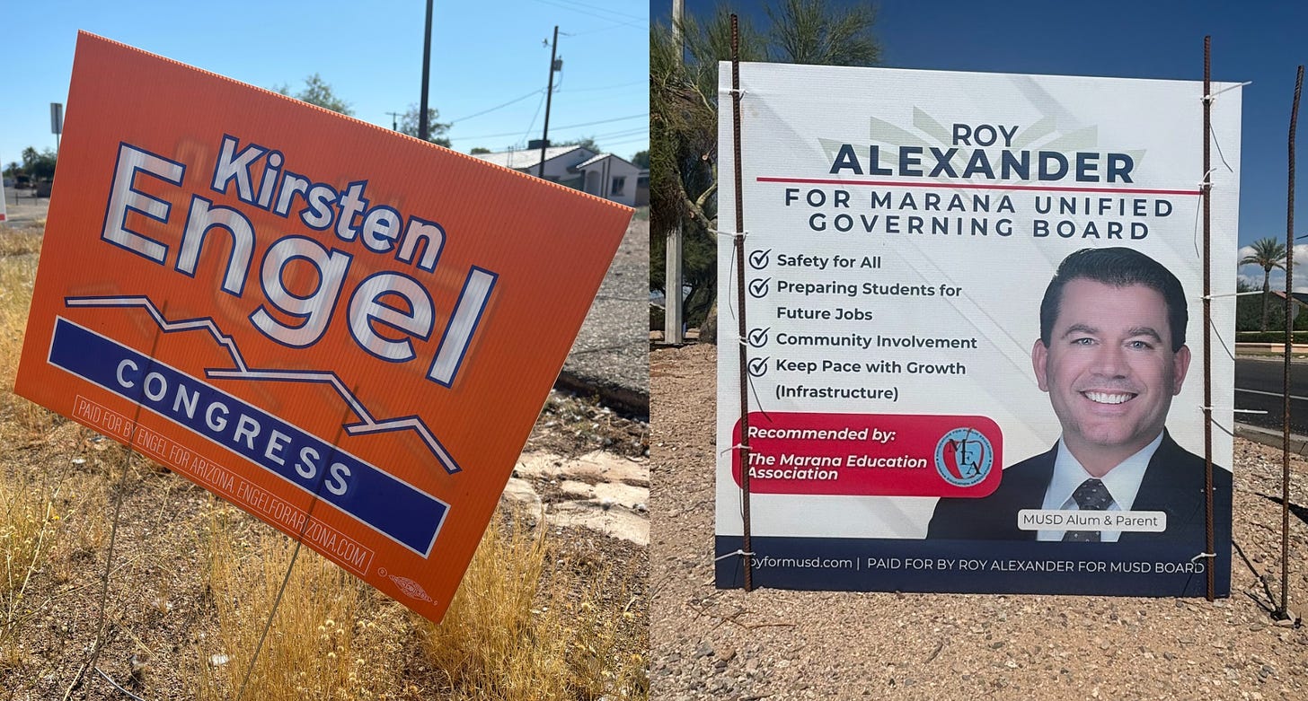
Far too many political signs simply lack creativity.
If your name, position and an American flag is the best you can come up with to advertise your vision, how can voters possibly trust you to find creative approaches to our most pressing problems?
This creativity deficiency is especially prevalent among law enforcement officials, namely sheriffs. Yes, we all know the job comes with a badge. No, it doesn’t have to be your logo.
On the other side of the spectrum, school board candidates seem to most often fall victim to the fallacy that people want to read a multi-point policy briefing and bio while traveling 45 miles per hour.
While it doesn’t have to be flashy, your sign should make a statement.
But keep it short.
The striking
We have to look at this junk on the side of the road for months — a little design, color and art goes a long way.
Bonus points if your name lends itself to a cool logo.
The stackers
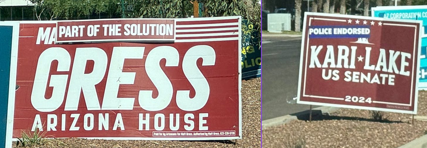
Oftentimes, candidates will put up their signs, and then staple more signs on top of the first signs.
These little add-ons can help candidates change the messaging between the primary and general elections or reflect developments in the race.
Republican state Rep. Matt Gress, for example, started adding “part of the solution” boosters on his signs after the primary. U.S. Senate candidate Kari Lake started adding a little “police endorsed” tag on her signs, seemingly after the Arizona Police Association endorsed her Democratic opponent, Ruben Gallego.
The attackers
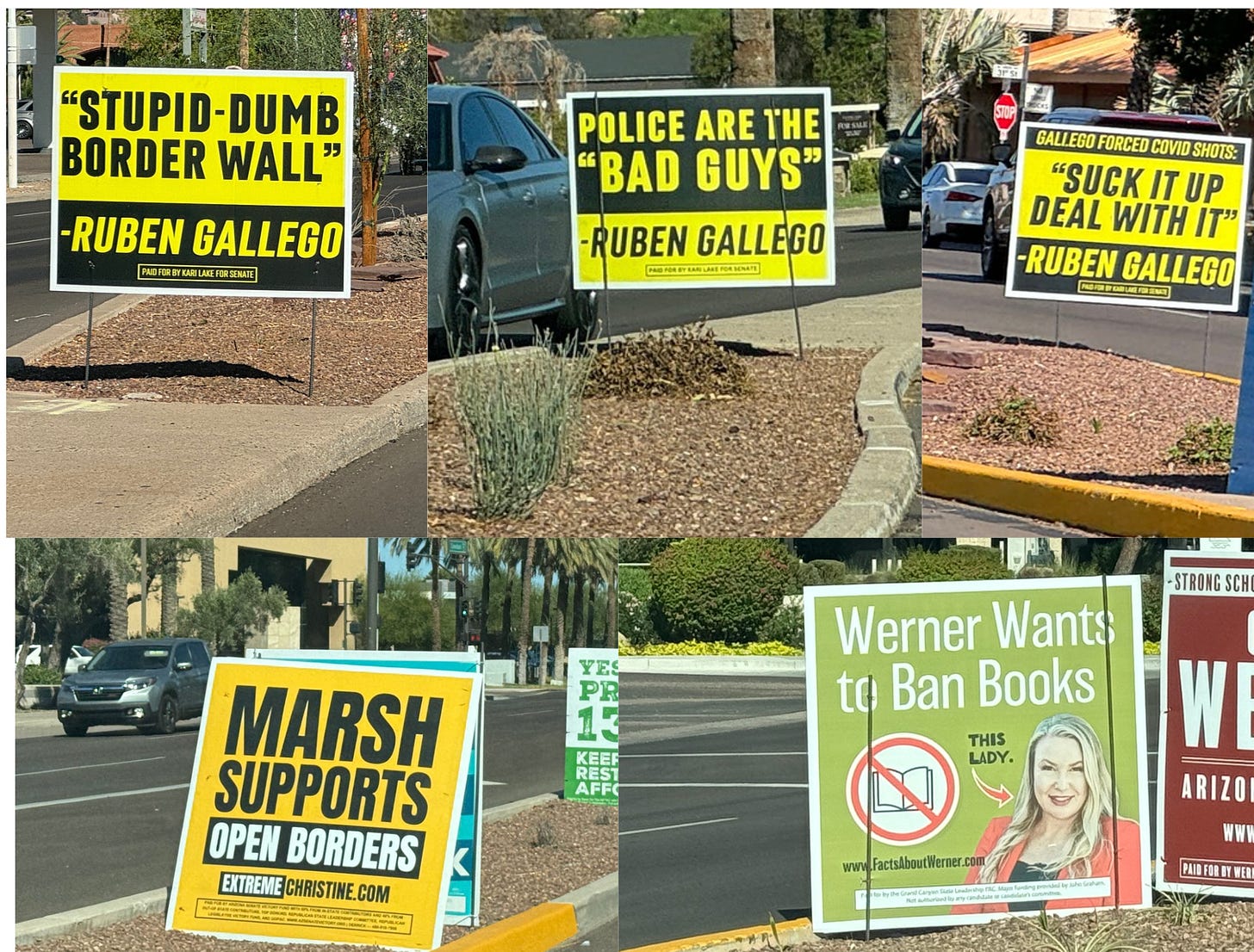
Speaking of Lake, lately, she’s been putting up nearly as many roadside signs attacking Gallego as signs promoting herself. That tells us she knows she’s in trouble.
The attack signs, however, are pretty effective.
The series pulls a string of quotes from Gallego that paint him as an anti-cop liberal extremist.
Bonus points for making them all readable at 60 mph and color-coordinating the entire campaign.
We’re also partial to signs advertising attack websites, like the ones going up against Democratic state Sen. Christine Marsh in central Phoenix asking voters to visit extremechristine.com. Marsh’s campaign is hitting back with her own informative attack pieces against Republican challenger Carine Werner, directing voters to factsaboutwerner.com.
We gotta say, the “this lady” arrow really pulls the whole sign together.
The lookers
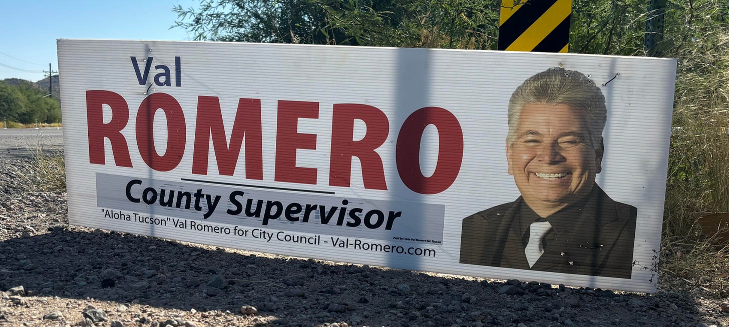
There’s a rule of thumb that any professional campaign consultant will tell you: Only put your face on your sign if you are objectively beautiful.
Some candidates ignore the rule at their own peril.
But Pima County Supervisor hopeful Val Romero knows this rule and he lives by it. He looks downright dapper in his signs (even if they lack proper disclosure and are recycled from his failed city council campaign).
The liars
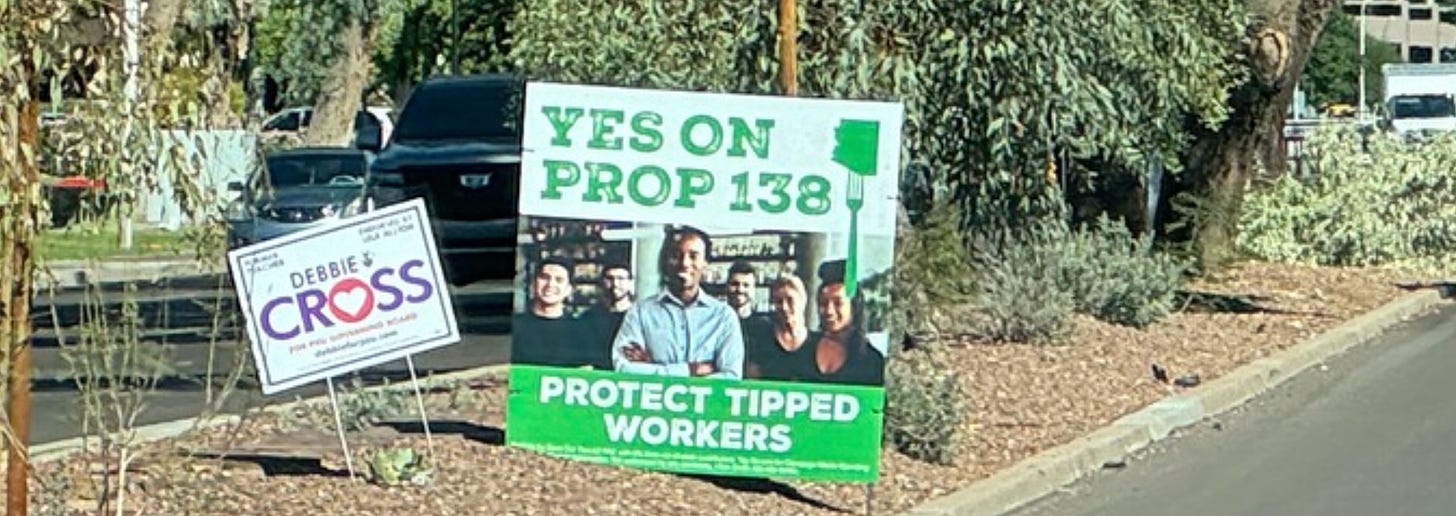
The signs for and against propositions are often wildly misleading, but the most egregious has to be the campaign for Prop 138, the “Tipped Worker Protection Act,” which would cut tipped workers’ pay.
All these baristas, bartenders and servers look stoked that their pay is about to get slashed, which somehow seems unrealistic to us.
The weird
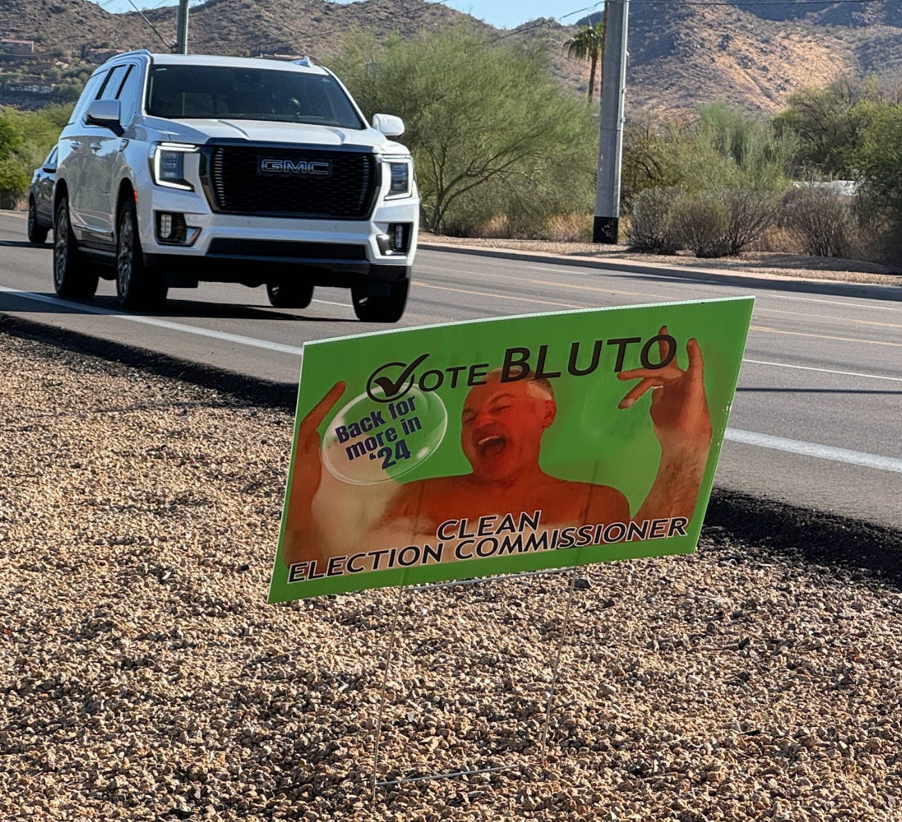
Of course, every election season we see a few signs where we just don’t know what they’re advertising.
Case in point, there is no “Bluto” running for Corporation Commission. Maybe the sign promoting “Bluto” for Arizona Corporation Commission comes from write-in candidate Frank Bertone, who we noted last week is a Democratic QAnon believer who wants to give everyone free electricity.
But honestly, we have no idea.
Just kidding. He always snaps pics responsibly.


